Amaara is an FMCG food brand inspired by the culinary traditions of Bangladesh, India, and Pakistan, offering a range of authentic products rooted in taste, culture, and familiarity. This project was developed while I was working with The Neat Trick, a strategy-led creative design studio. I worked on the brand identity and packaging for Amaara, exploring two different directions for the identity system. The version showcased here reflects my own exploration and design approach. The work formed part of my undergraduate communication design thesis, and a link to the full thesis project is included at the end for further context.

Listening
Through conversations with the target audience and an exploration of cultural cues, themes of home, taste, tradition, and authenticity began to surface repeatedly. The idea of ghar ka swaad—food that carries memory, comfort, and familiarity—became a central emotional anchor. Alongside this, visual references drawn from divinity, organic forms, and cultural symbolism revealed a sense of quiet strength and reverence embedded within tradition. The tagline emerged was "Flavours From Home". These insights shaped the foundation of the identity, guiding it toward a language that feels warm, rooted, and culturally resonant, while still allowing space for contemporary expression.
Service
Brand Design
Building
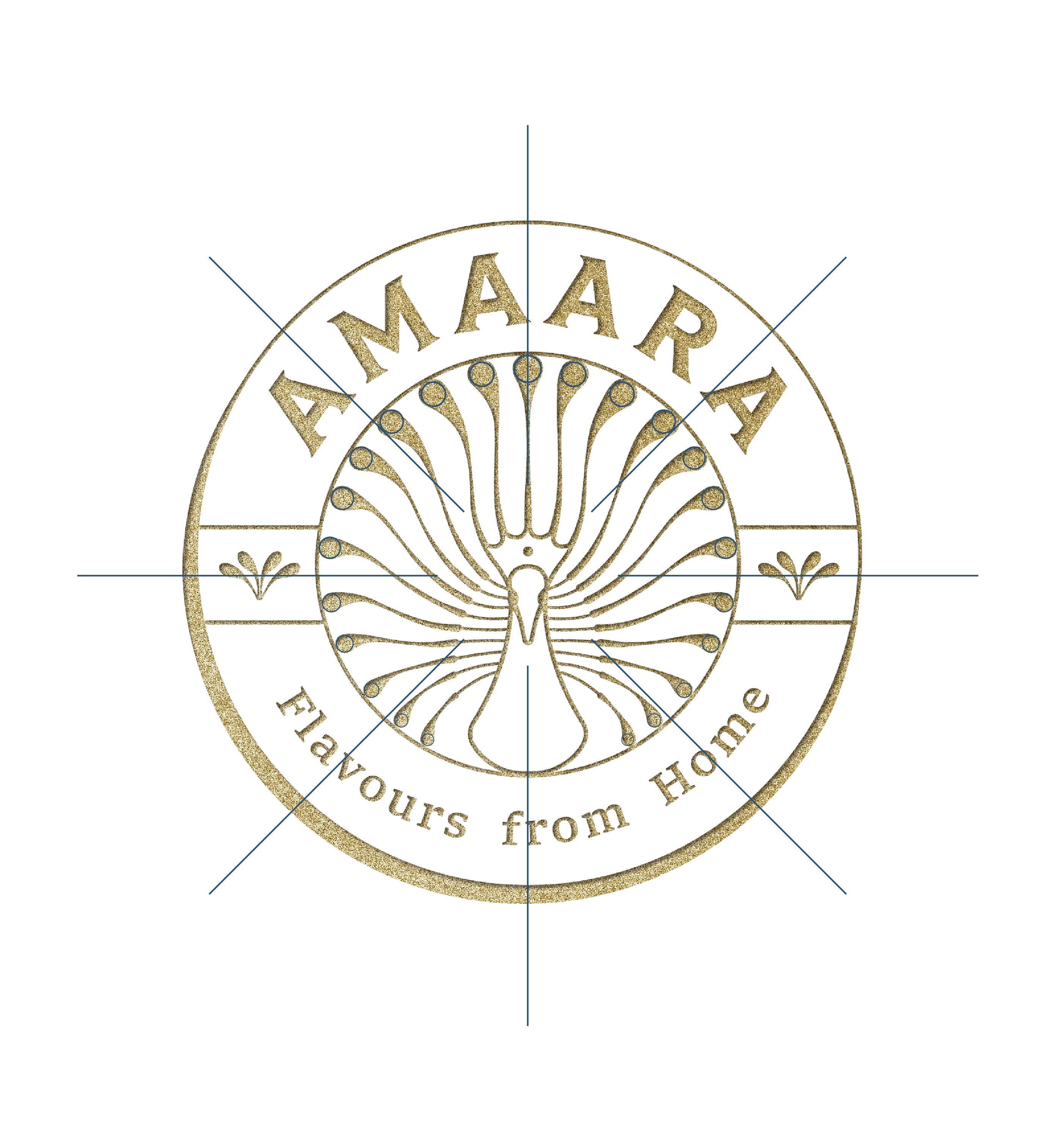
The identity began to take form through the logomark, where the letter A from the typeface Tiller was inverted. The symbol is a hybrid between a peacock and a goddess, drawing from associations of positivity, prosperity, and grace that resonated with the target audience. Rather than depicting a traditional peacock with fully spread wings, the motif was interpreted in a more stylised and contemporary manner. This abstraction allows the symbol to feel mythical yet modern, retaining its cultural references while remaining refined within the identity system.


Becoming
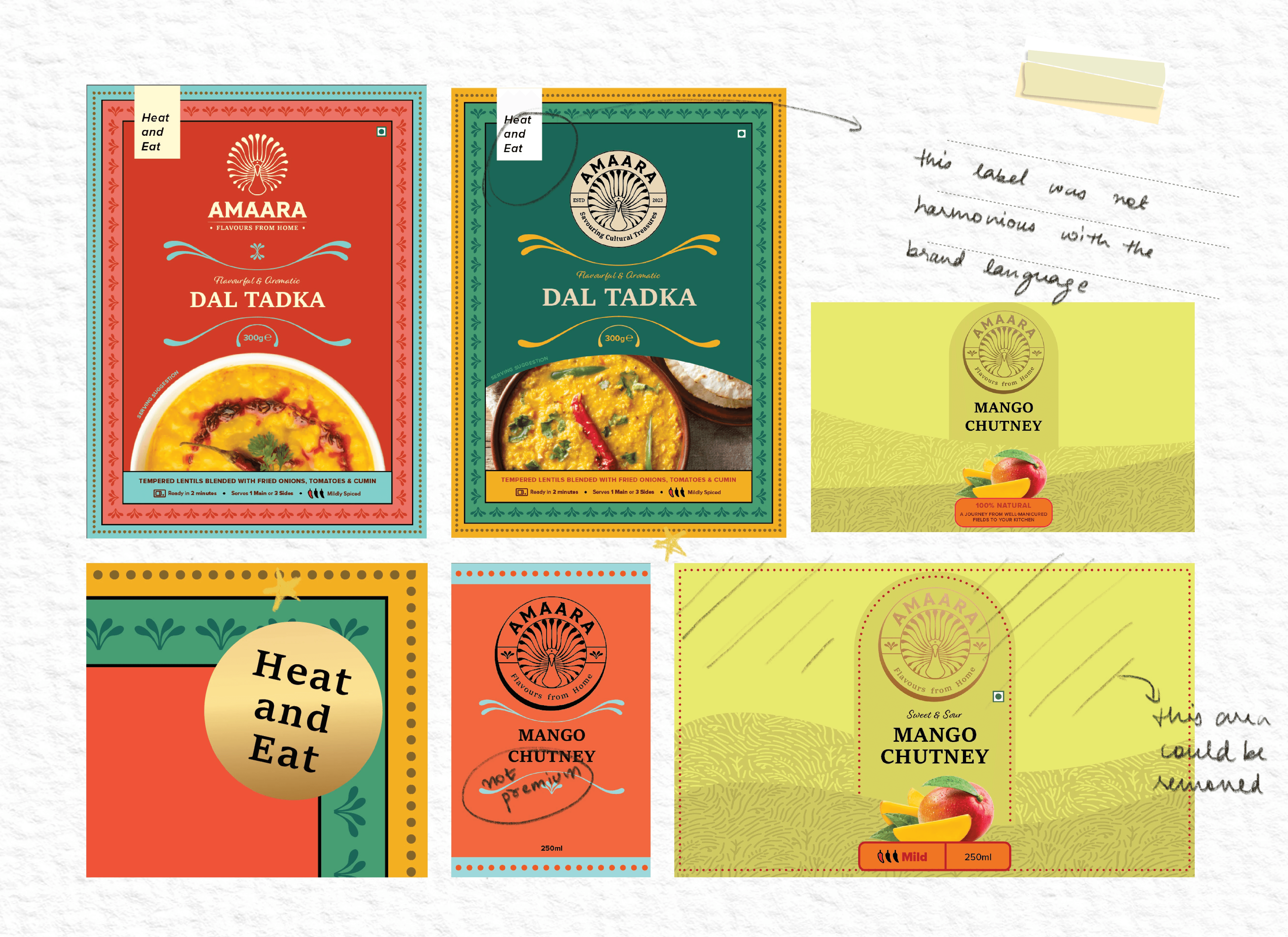
As the project progressed, the identity expanded into a broader system through packaging explorations and layout studies. Different colour palettes, compositions, and product formats were tested to understand how the brand could live across multiple SKUs while remaining cohesive.
Through these iterations, the visual language was refined across packaging, print textures, and brand applications, gradually shaping a system that could adapt while maintaining clarity and consistency.